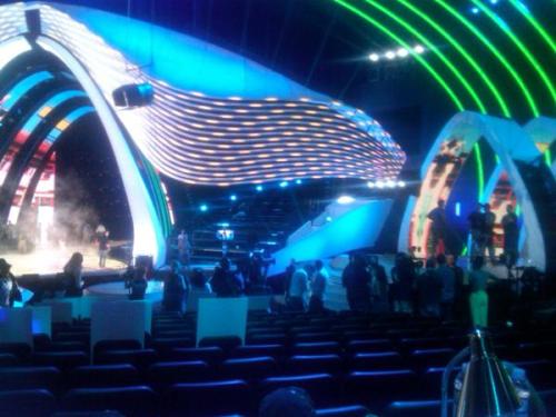
Stephen Friedman, President of MTV, and Jesse Ignjatovic, executive producer for the VMAs gave an exclusive interview from TheWrap.com about the features of this year's MTV VMA stage design.
"We were looking at our audience and the way they interact and engage with music today, and thinking, how do we bring that to television?" said Ignjatovic. "So our jumping-off point was that idea of people being able to engage with music in a timeless way, on transporting you on a journey through a space-time continuum of music."The 2011 MTV Video Music Awards, hosted at the Nokia Theatre in Los Angeles took us on a journey beginning with the
| Photo Credit: The Wrap |
"Reinventing the wheel is the whole point of the VMAs; where most awards shows have a firm template and can only make minor changes year to year, MTV's extravaganza varies dramatically from one show to the next." (Source)
In my opinion, this is a great concept. Sometimes when we listen to music or watch a music video, experience the onstage personalities of our favorite performer or watch their performance we forget that music is not only transcendental but timeless. Music has a way of taking from the past and collaborating it with the future. I loved the stage design this year. It was very chic, modern, and futuristic. The stage itself looking like it was going farther and farther back in time...almost in 3D. I enjoyed how not only did the back screen showcase a variety of animations, but the screens within the white arches had very good animations as well. The spades shaped stage, further transforming into a curved shape, itself was quite unexpected...most people wouldn't notice, but I noticed that the stage itself had it's own underlit smart lighting as well. It was very subtle, but very on point with the overall theme of modern/ futuristic simplicity. Meaning, the clean lines, monochrome, and simplicity. And lest I forget the lines descending from the entire structure? To me it looked like the lines of sheet music...coinsidence? Probably not.
 |
| Photo Credit: http://www.iloveyougagaloo.com/ |
All in all, very nice stage design and even better concept behind it...but please for the love of quality performances do better on your lighting!
What did you think of the 2011 MTV Video Music Awards set design last night?
The Unemployed Entrepreneur
No comments:
Post a Comment
Thanks for your comment!!!!!